
Campaign planning
Seasonal product photography with a consistent style
Plan seasonal product photos with consistent colours, framing and lighting. Refresh your storefront while checking each image against the product.
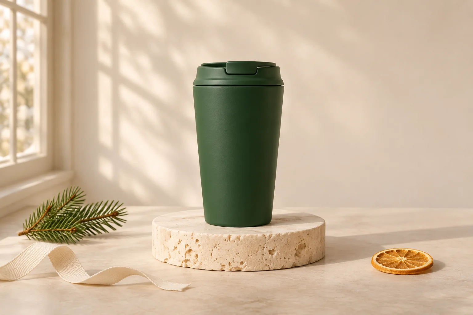
Seasonal product photos can give a familiar catalog a fresh reason to be noticed. The difficulty is keeping the range recognisable when backgrounds, props and campaign colours change. A useful seasonal set should feel like your store at a different time of year.
Start with the product and the purpose of the campaign. A gift guide, a collection banner and a product card need different kinds of space. You do not need to add every seasonal symbol to make the theme clear.
Keep one dependable everyday image
Retain a clear, accurate product view that works outside the campaign. It gives shoppers a stable reference when the seasonal picture is more expressive. Keep genuine detail views for labels, closures, materials and anything included in the purchase.
For a green travel cup, for example, you could keep the usual plain-background image and add a pale winter scene with a small pine sprig placed away from the cup. The prop supplies context while the product stays easy to inspect. A generated prop is not evidence of size or an included accessory.
Choose the decisions that will stay consistent
Write down a few visual rules before creating the set. Decide on the background family, light direction, framing and the amount of empty space. Keep the product’s scale reasonably consistent across comparable cards so a tighter crop does not imply a larger item.
Then select one or two seasonal changes. A ribbon colour, a small natural prop or a slightly warmer background may be enough. Strong decorative colours can reflect onto white packaging, so check the product colour again after styling.
- One background family for the campaign.
- A consistent main light direction.
- Similar framing for comparable products.
- A limited seasonal colour palette.
- A clear rule about how many props are allowed.
Make the creative brief specific
Describe the surface, light and placement rather than asking only for a festive or premium image. A brief such as pale stone, gentle side daylight and one small seasonal detail gives you more to review than a string of broad adjectives.
If a banner needs a headline, plan the empty space before generating. Keep a separate straightforward crop for product cards. Avoid trying to make one picture serve every shape if that means cutting off the product.
In BestImage, inspect Scene and Adjust before reviewing the setup. Record the choices with the project so the next item starts from the same intention. Saved settings help organise the workflow, but they do not guarantee identical backgrounds or lighting across separate generations.
Review the set together and the products individually
First compare each result with its own reference. Check lettering, colour, product count and visible construction. Then place the selected images next to one another and look for unexpected changes in warmth, scale and shadow direction.
Keep decorative effects away from important features. A ribbon should not conceal a clasp, and snow or greenery should not imply a different product finish. Do not let a scene suggest that packaging or a gift is included when it is not.
Reject inaccurate variants even if they fit the campaign beautifully. The AI product review checklist is useful here, followed by the wider checks in our catalog consistency guide.
Make the next campaign easier to prepare
Save the approved master, reference and delivery versions with clear campaign names. Note which crop suited the banner and which suited the listing. Keep the everyday image easy to find so the store can return to a neutral presentation when the campaign ends.
To begin, open Studio with one checked reference and plan a restrained seasonal variation. Review it fully before creating the rest of the set. A small, coherent collection is more useful than many images that disagree about the product.
Continue reading
All Insights ↗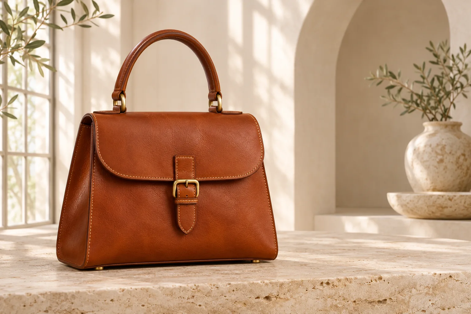
Leather goods & Studio workflow
AI handbag photography: a practical Studio workflow
Follow a documented BestImage handbag workflow, from an AI-created reference to a daylight scene, with saved settings and practical review checks.
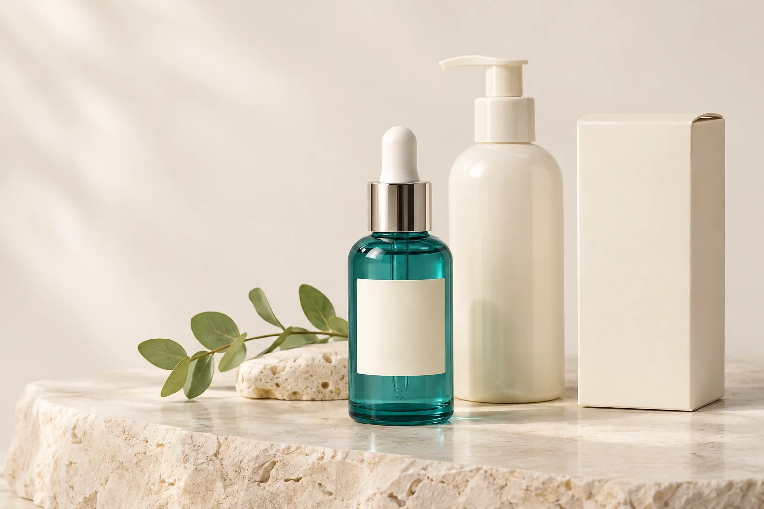
Beauty & packaging
Skincare product photography: labels, colour and light
Photograph skincare packaging with clearer labels, controlled reflections and consistent colour. Check the details before publishing AI-edited images.