
Beauty & packaging
Skincare product photography: labels, colour and light
Photograph skincare packaging with clearer labels, controlled reflections and consistent colour. Check the details before publishing AI-edited images.
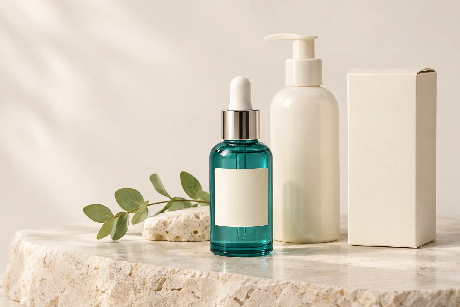
A skincare photograph has two jobs: make the packaging appealing and make the product easy to identify. A beautiful reflection is not helpful if it runs straight through the product name. A warmer background is not helpful if a white jar starts looking yellow.
Begin with the information a shopper needs to see. That often means the front label, bottle shape, dispenser and the amount of product being sold. Decorative ingredients and bathroom props come later.
Photograph the label before styling the scene
Turn the main label towards the camera and keep the bottle upright. If the label curves around the container, a separate close-up may explain it better than trying to show everything in one frame. Photograph back-panel information directly when it is needed. Do not ask AI to invent text that was never visible in the reference.
Check small differences between similar products. Two serums may use the same bottle but different names, sizes or label colours. Keep a simple file note linking each reference to the correct product variant. A convincing image attached to the wrong listing is still a bad product image.
Move the reflection away from the important details
Try soft window light from the side, with a piece of white card on the darker side. Rotate the bottle slightly and watch where the bright reflection moves. A broad, gentle highlight can describe a glossy surface without covering the label.
Take another reference if the lettering is blurred or hidden by glare. Turning up brightness afterwards will not recover information that was not captured clearly. For glass droppers, also inspect the edge of the bottle, the cap and the visible pipette.
Our guide to shiny and transparent products explains a more controlled starting setup. Keep any diffusion material safely away from heat sources.
Keep packaging colour consistent
Use one main light source where possible. Daylight mixed with a warm ceiling lamp can give different parts of a white carton different colours. Switch off the nearby lamp and take a fresh shot before trying to correct the image.
Compare the photograph with the actual packaging under neutral light. A display’s brightness, colour settings and surrounding light affect what you see, so do not treat a single phone screen as a colour measurement. Products whose colour is critical may need a managed photography workflow.
When choosing a scene, watch for colour reflected from props. A green leaf close to a white jar can introduce a green cast. Move the prop away or choose a quieter setting rather than making the packaging fight its surroundings.
Use AI scenes for context and review the packaging closely
A clean bathroom shelf or pale stone surface can help a skincare range feel cohesive. Start with a restrained scene, then review adjustments before generating. Avoid a brief that asks for several new objects, dramatic lighting and a different camera angle all at once.
After generation, compare the product name, lettering, cap, pump and container proportions against your reference. Creative editing can redraw those details. An image that changes the amount shown, adds a dispenser or implies an included gift should not be published as an accurate product view.
- Read the label instead of judging it from a thumbnail.
- Count bottles, lids and included accessories.
- Check the shape and direction of the pump.
- Confirm the correct size and variant are represented.
- Remove props that imply ingredients, benefits or accessories the product does not have.
Plan the range as a small system
Choose a repeated background, camera height and light direction for the product family. Photograph a size comparison when customers need to distinguish a travel bottle from the full-size version. Keep individual product views as well as any group photograph.
Use a genuine photograph when exact label text must be shown. A lifestyle scene can support that evidence, but it should not replace it. Read our consistent catalog guide, then open Studio with one clearly identified reference.
Continue reading
All Insights ↗
Image sizing & delivery
Resize product photos without cropping the product
Resize product photos while keeping handles, lids and edges in frame. Understand pixels, aspect ratios, file formats and BestImage upload limits.
Campaign planning
Seasonal product photography with a consistent style
Plan seasonal product photos with consistent colours, framing and lighting. Refresh your storefront while checking each image against the product.